clearvars
syms f f0
lowpass = @(f, f0) 1./sqrt(1 + (f/f0).^2);
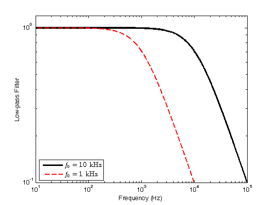
f0 = 1e4;
ff = logspace(1, 5, 1000);
loglog(ff, lowpass(ff, f0), 'k-', 'LineWidth', 2.5)
xlabel('Frequency (Hz)')
ylabel('Low-pass Filter')
axis([10 1e5 0.1 1.2])
hold on;
f0 = 1e3;
loglog(ff, lowpass(ff, f0), 'r--', 'LineWidth', 1.5)
legend({'$f_0 = 10$ kHz', '$f_0 = 1$ kHz'}, 'Interpreter', 'LaTeX', 'location', 'southwest')
hold off;
figure();
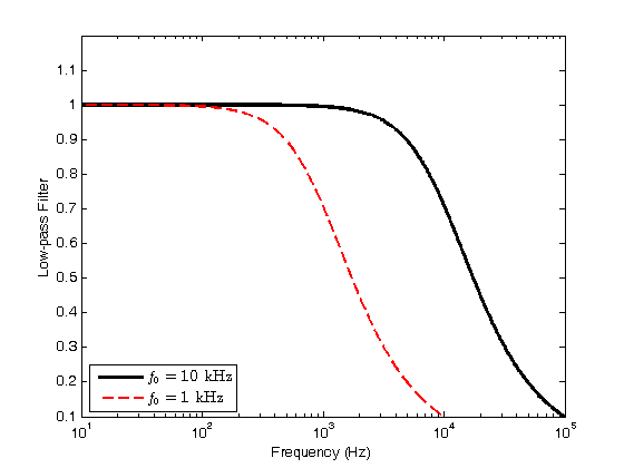
f0 = 1e4;
semilogx(ff, lowpass(ff, f0), 'k-', 'LineWidth', 2.5)
xlabel('Frequency (Hz)')
ylabel('Low-pass Filter')
axis([10 1e5 0.1 1.2])
hold on;
f0 = 1e3;
semilogx(ff, lowpass(ff, f0), 'r--', 'LineWidth', 1.5)
legend({'$f_0 = 10$ kHz', '$f_0 = 1$ kHz'}, 'Interpreter', 'LaTeX', 'location', 'southwest')
hold off;
figure();
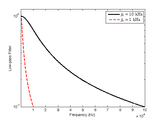
f0 = 1e4;
semilogy(ff, lowpass(ff, f0), 'k-', 'LineWidth', 2.5)
xlabel('Frequency (Hz)')
ylabel('Low-pass Filter')
axis([10 1e5 0.1 1.2])
hold on;
f0 = 1e3;
semilogy(ff, lowpass(ff, f0), 'r--', 'LineWidth', 1.5)
legend({'$f_0 = 10$ kHz', '$f_0 = 1$ kHz'}, 'Interpreter', 'LaTeX', 'location', 'northeast')
hold off;
figure();
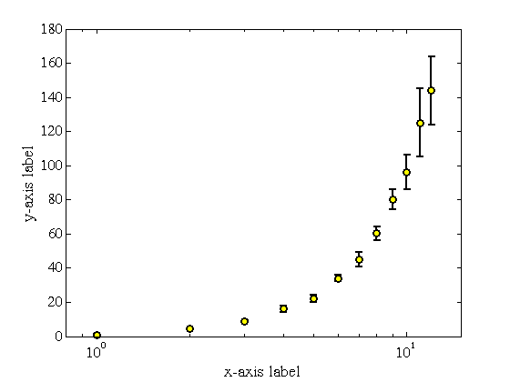
x = [1, 2, 3, 4, 5, 6, 7, 8, 9, 10, 11, 12];
y = [1.02, 4.3, 8.6, 16, 22, 34, 45, 60.2, 80.1, 96, 125, 144];
dy = [.3, .3, .5, 2, 2, 2, 4, 4, 6, 10, 20, 20];
formattedPlot = errorbar(x, y, dy, 'ko', 'MarkerSize', 6, 'LineWidth', 1.5, 'MarkerFaceColor', 'y');
xlabel('x-axis label', 'FontSize', 14, 'FontName', 'Times')
ylabel('y-axis label', 'FontSize', 14, 'FontName', 'Times')
set(gca, 'FontSize', 12, 'FontName', 'Times')
axis([0.8 15 0 180])
set(gca, 'XScale', 'log');
figure();
x = [1, 2, 3, 4, 5, 6, 7, 8, 9, 10, 11, 12];
y = [1.02, 4.3, 8.6, 16, 22, 34, 45, 60.2, 80.1, 96, 125, 144];
dy = [.3, .3, .5, 2, 2, 2, 4, 4, 6, 10, 20, 20];
formattedPlot = errorbar(x, y, dy, 'ko', 'MarkerSize', 6, 'LineWidth', 1.5, 'MarkerFaceColor', 'y');
xlabel('x-axis label', 'FontSize', 14, 'FontName', 'Times')
ylabel('y-axis label', 'FontSize', 14, 'FontName', 'Times')
set(gca, 'FontSize', 12, 'FontName', 'Times')
axis([0 13 0.4 300])
set(gca, 'YScale', 'log');
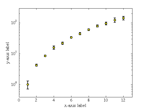
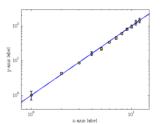
figure();
x = [1, 2, 3, 4, 5, 6, 7, 8, 9, 10, 11, 12];
y = [1.02, 4.3, 8.6, 16, 22, 34, 45, 60.2, 80.1, 96, 125, 144];
dy = [.3, .3, .5, 2, 2, 2, 4, 4, 6, 10, 20, 20];
formattedPlot = errorbar(x, y, dy, 'ko', 'MarkerSize', 6, 'LineWidth', 1.5, 'MarkerFaceColor', 'y');
xlabel('x-axis label', 'FontSize', 14, 'FontName', 'Times')
ylabel('y-axis label', 'FontSize', 14, 'FontName', 'Times')
set(gca, 'FontSize', 12, 'FontName', 'Times')
axis([0.8 15 0.4 300])
set(gca, 'XScale', 'log');
set(gca, 'YScale', 'log');
hold on;
xx = logspace(-1, 2, 1000);
plot(xx, xx.^2, 'b-', 'LineWidth', 1.5)
hold off;